The “meet the team” page on any website is a key recruitment tool. Potential applicants want to know that your company is a fun, people-centric place to work – and the team page is the perfect place to communicate that.
That’s why we recently re-built our own team page from the ground up; as we just recently closed our seed round of funding, we’re expanding our team. In this period of growth, attracting job seekers who are excited and invested in working with our team is a priority.
When we were creating an “our team” page optimized for attracting top talent, we drew inspiration from some awesome websites. Here’s our round-up of our top 5 favorite team pages.
It's time for a talent revolution.
Reveal human potential to revolutionize how you hire, grow, and retain talent with Plum.
1. Humaan
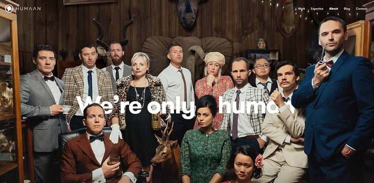
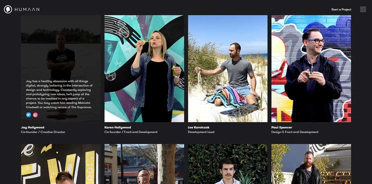
This team page has a quirky, vibrant energy that immediately catches your attention – a good sign for a design company. Each animated portrait captures the team member and their personality, from their animations, scenes, and written blurbs.
The bright colors, what we do/what we don’t section, and quality images showcase their culture at an emotional level – open, creative, funny, and a little quirky. Not only is this a company you want to work for, but as an agency, it’s a company you want to work with. You know that by working alongside Humaan, you’re going to get the project done, and have a lot of fun doing it.
2. Salted Stone
As another agency, Salted Stone has a very clean and professional presentation on their team page – but that doesn’t stop them from showcasing every individual’s personality through genuine smiles and expressions in their team headshots.
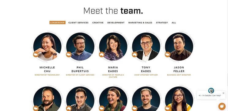
The treatment of each photo is wonderful – they’re high-resolution, and the warm tone of every person contrasted on the blue background keeps the company’s brand colors in mind while still feeling natural. This is especially impressive considering Salted Stone operates across the globe (highlighted by the country silhouette in the corner of every headshot).
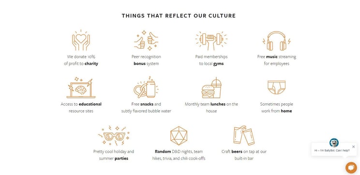
We also love the use of copy and iconography to give potential job applicants a peek into the company culture (the work-from-home icon definitely had us chuckling).
3. Kickstarter
Kickstarter groups their team not by department, but by interest (dancers, D&D players, foodies, etc.) which meshes well with their creative crowdfunding platform.
This is a super fun team page with lots of vibrant colors and high-contrast photo treatments that tie all the portraits together. Kickstarter does a great job of showcasing a fairly large team without it feeling faceless or overwhelming. No one looks uncomfortable; in fact, whether it’s through a genuine smile or a quirky prop, every headshot connotes personality.
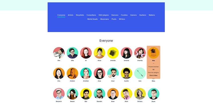
When you scroll over each portrait, you get a glimpse into how many Kickstarter projects each person has contributed to, including the category of projects they’re most consistently backing. It’s a smart way that Kickstarter communicates its own employee’s dedication to the product while signifying a little added dash of individual charm.
4. Oak & Rumble
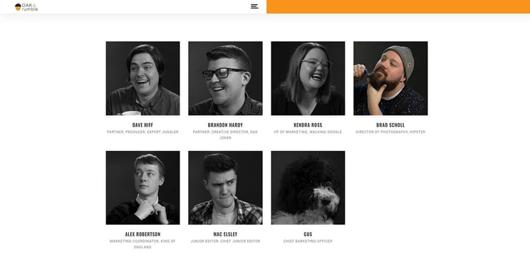
The images on Oak & Rumble’s team page are professional and high-quality – exactly what you’d like to see from a video production company. There is a great UX moment of delight as you scroll over the portraits and they appear in color; the subtle warm hue ties all the photos together to the brand orange.
The goofy but genuine expressions of each portrait, paired with the unconventional taglines for each role, point towards a fun and lighthearted culture (although we would love to see a bio or more information for each team member, as it’s a small enough team to warrant that level of detail!). Also, who doesn’t want to work for a company that has a Chief Barketing Officer!?
5. Etsy
Etsy does a great job of highlighting their leadership team – we love the warm, almost candid feel of the photos that makes each person look natural and relaxed. You can click through to read each leader’s bio.
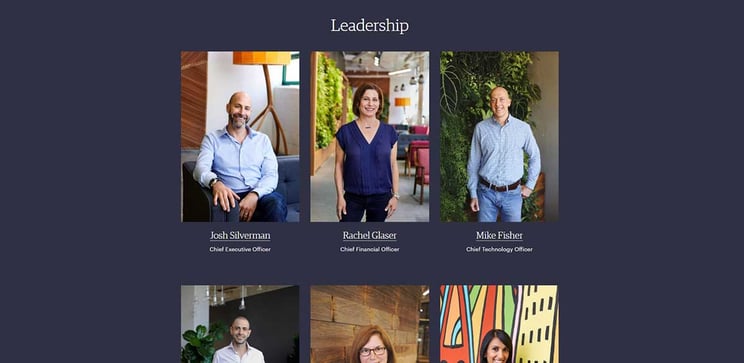
The collage of other team members below is a little too small and faceless in our opinion, especially considering the aspect ratio awkwardly cuts off people’s heads in a lot of portraits. While we understand it’s hard to showcase a large group of employees, we think the rest of the team page could use a bit more care!

No matter your company size, there are some great examples of “meet the team” pages out there that can inspire your own team page to communicate culture, brand, and personality. Don’t underestimate the value of an excellent team page – showcasing that your company is full of personality, fun, and genuine people is a foundational aspect of recruitment marketing and candidate experience.

Ursula Gray is the graphic designer at Plum. When she's not creating cool mid-century modern illustrations, you can find Ursula hanging with her mini home zoo consisting of 3 dogs, 2 cats, and a lizard.
